|
Dear Friend,
It looked perfect on screen.
This month's Bolder is about the details that don't make the case study but make all the difference in the real world. The colour that doesn't reproduce. The font that's unreadable at distance. The brand that looks beautiful in a pitch deck and falls apart on a shopfront. These aren't small decisions. They're the ones your customers actually experience.
Each month, we break it down the same way:
01. The Shift - One strategic insight about brand or business.
02. The Work - One moment from a recent project
03. The Find - One resource worth your time
04. The Question - One question to sit with
Let's get into it.
|
|
|
|
 |
 |
|
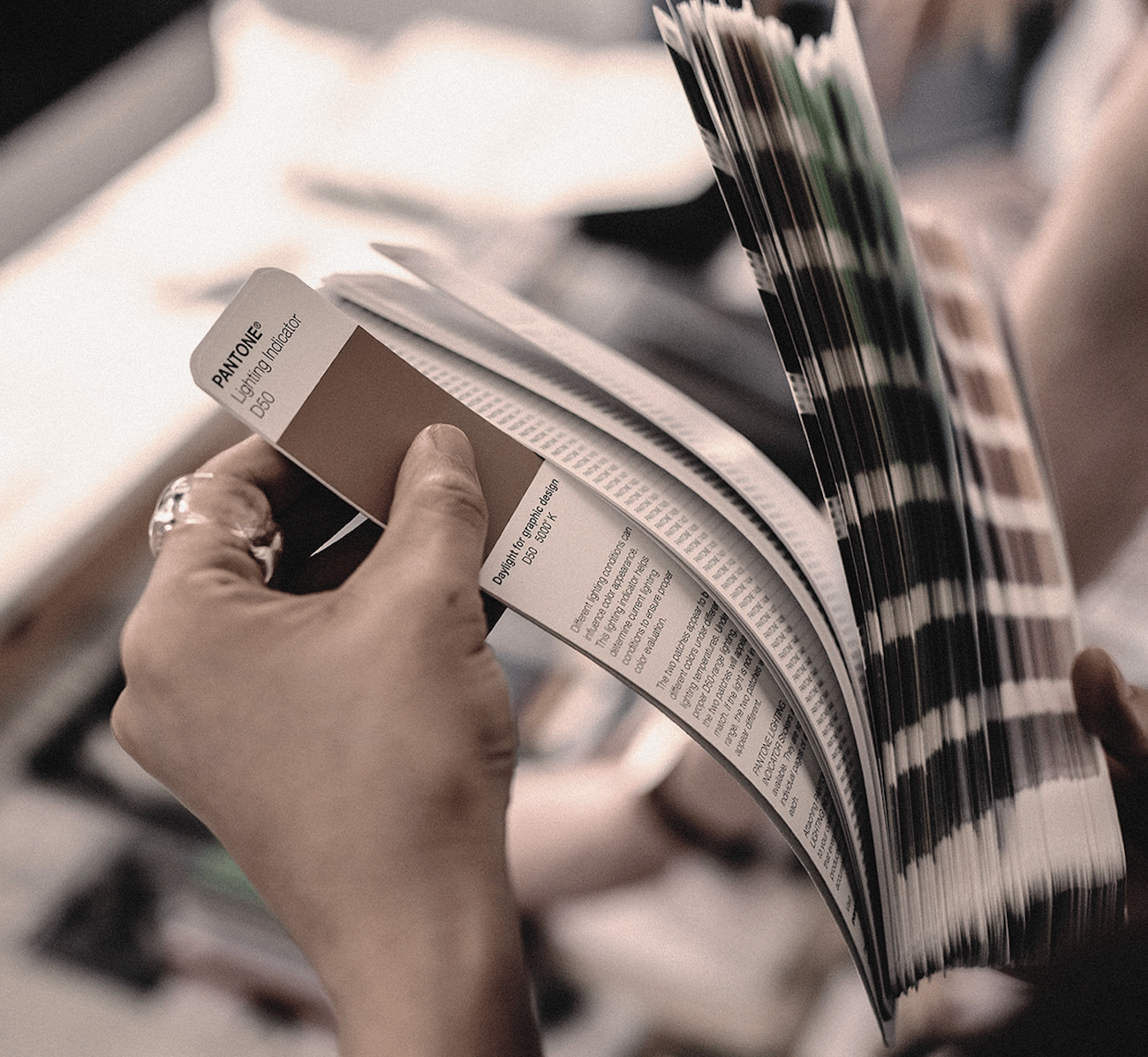
Colour is one of the most important decisions in any brand project. It's also one of the hardest to get right.
Most clients underestimate colour. They see it as a preference ("I like blue") rather than a strategic decision with real-world consequences.
But colour behaves differently on screen, on paper, on fabric, on signage, and under different lighting. A shade that looks sophisticated in a Figma file can look completely wrong on a shop fascia at night. A rich tone that works beautifully in print can wash out entirely on a website.
Matching a single colour consistently across every medium is harder than most people realise. It's not a matter of picking a Pantone and moving on. It sometimes means working with percentages of a colour, adjusting for substrates, and testing in environments that a design studio can't simulate.
The brands that feel effortlessly consistent? That consistency was hard-won. And it almost always started with someone taking colour seriously enough to test it where it actually lives, not just where it was designed.
Read: Do Brand Colours Really Have Psychological Meaning?
|
|
|
 |
|
Move Home - Making Dublin's most distinctive estate agent look the part
Move Home had everything a competitor would envy. Over 800 five-star reviews, deep roots in northside Dublin, an award-winning shopfront redesigned multiple times a year, and a founder whose calligraphy background brings a personal touch no other agent can match.
But the brand wasn't telling any of that story. From the outside, Move Home looked like every other estate agent on the street.
We did a full rebrand. Identity, collateral, and website, all designed to hero the things that genuinely set them apart. The community presence. The northside expertise. The craft behind every client relationship.
See the Case Study
|
 |
|
|
|
 |
 |
|
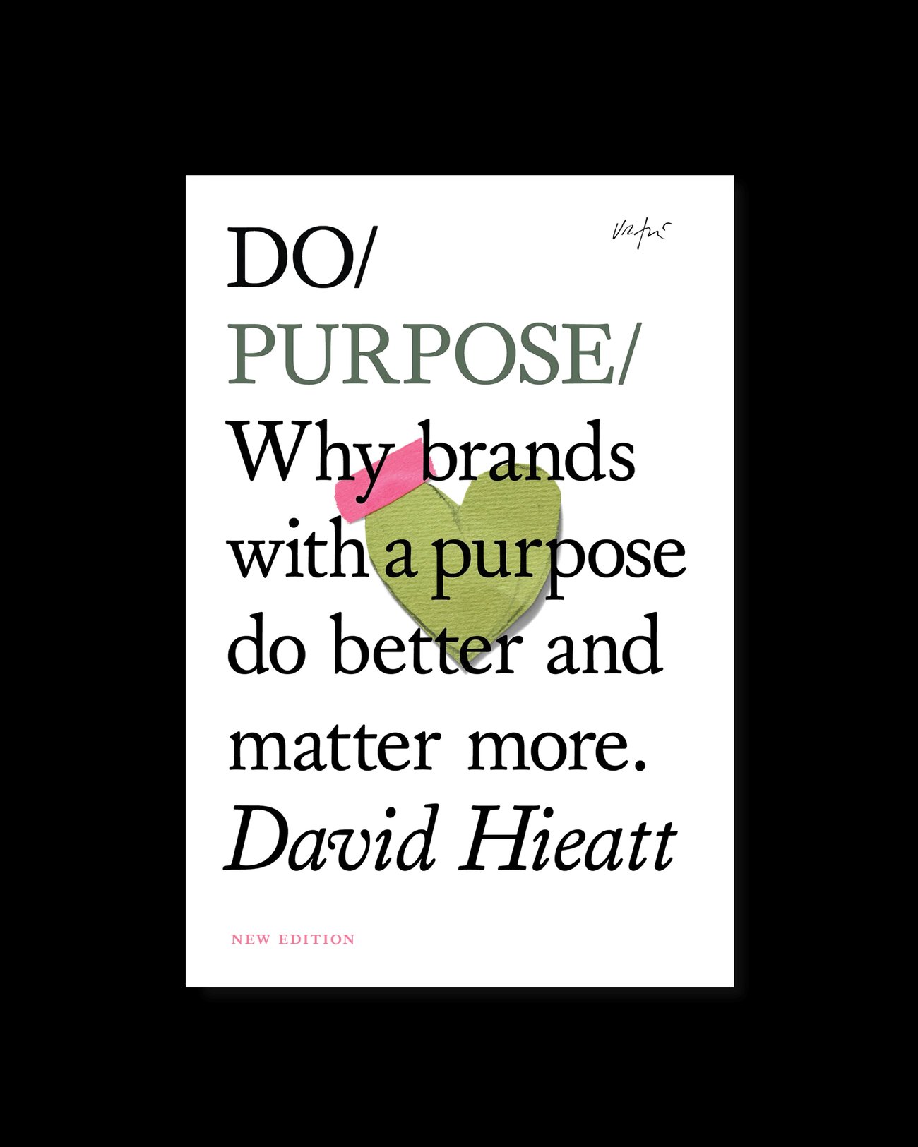
Do Purpose - David Hieatt (Book)
We've recommended this one to founders more than almost any other book. It's a short, sharp read about why purpose matters and how to find yours. Not the vague, corporate version of purpose. The real one. The kind that makes people care about your business beyond what you sell. If you're a founder and your "why" still feels unclear, start here. It won't take long to read. It will take a while to stop thinking about.
Get the book |
|
|
 |
When was the last time you experienced your own brand the way a customer does?
Not on your laptop. Not in a brand guidelines PDF. In the real world. On a phone screen in direct sunlight, on a sign from across the street, on a business card under fluorescent light. The version of your brand that lives on your desk isn't the one your customers see. Hit reply - we read every one. |
|
|
|
|
|
Got a brand challenge?
We're here to help. Book a call and let's talk it through - no pitch, no pressure, just honest advice from people who've seen it before. |
| Book a Call |
|
|
|
|
|
|
P.S. Share this newsletter with those who needs it. Forward it to them by sharing this link
P.P.S. If you haven't signed up yet, you can do it here
|
|
|
|
|
|
|
|